The Challenge
Security MicroImaging Corporation had a branding problem: they were a technologically advanced ECM (enterprise content management) company, but their 40-year old name did not reflect how their services had evolved over the decades. This meant their brand identity was no longer relevant and in desperate need of a refresh.

The Solution
We conducted category research, stakeholder interviews and trademark/digital analysis to develop a new name: Kiriworks.
The root word “kiri” comes from the Japanese paper-cutting art of kirigami—a perfect metaphor for a tech company whose goal is to eliminate paperwork from business processes in favor of electronic content management. “Works” was added to acknowledge the company’s reputation for thoughtful, high-integrity solutions that, simply put, just work the first time, every time.
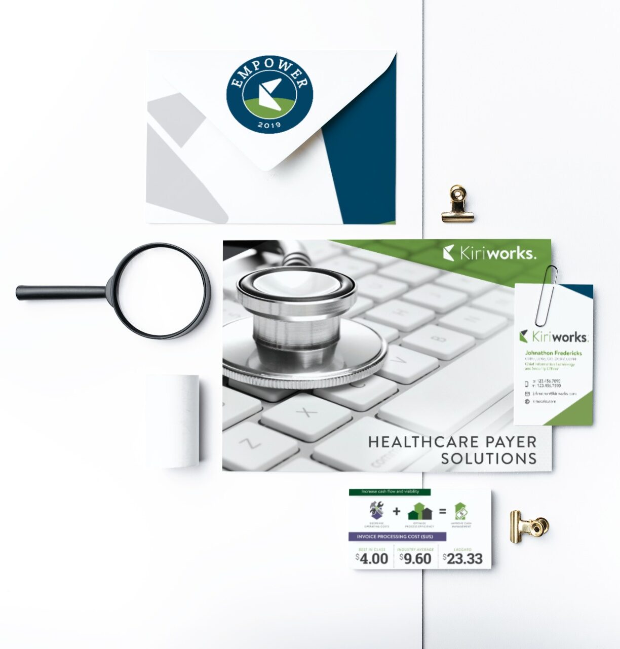
The resulting logo was simple and contemporary, leveraging the period to reinforce Kiriworks’ single-point solutions and commitment to excellence. We also developed brand guidelines and business cards as part of the rebranding process.

The Outcome
Roll out of the new brand identify was a seamless transition that has invigorated stakeholders and clients with a distinct, engaging and relevant vision for the future.
The process went so well that Kiriworks continues to use our agency years after the rebrand for design support on case studies, infographics, user events, trade show displays and more. We’ve even completely redesigned their WordPress website (twice!).


