The Challenge
Over the years, Astah’s website had become a complex mess of information that didn’t tell the story of their powerful product: a diagramming and modeling software.
Many important sections didn’t appear in the main navigation, software engineers (not marketers) designed and developed pages and the messaging didn’t clearly communicate the difference between their product offerings. In all, the site had hundreds of pages, many of which used inconsistent designs and did not interlink.

The Solution
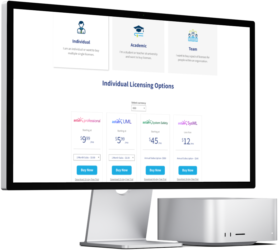
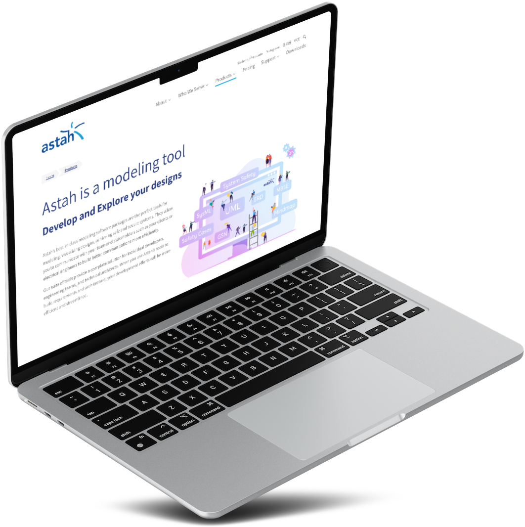
After taking inventory of the hundreds of pages on the current site, our first task was reorganizing everything into a thoughtful, user-focused sitemap. This included removing or combining dozens of pages and rewriting content to succinctly explain the features/benefits of each product. At the heart of the information architecture strategy? Driving visitors to the pricing and licensing pages for increased conversions.
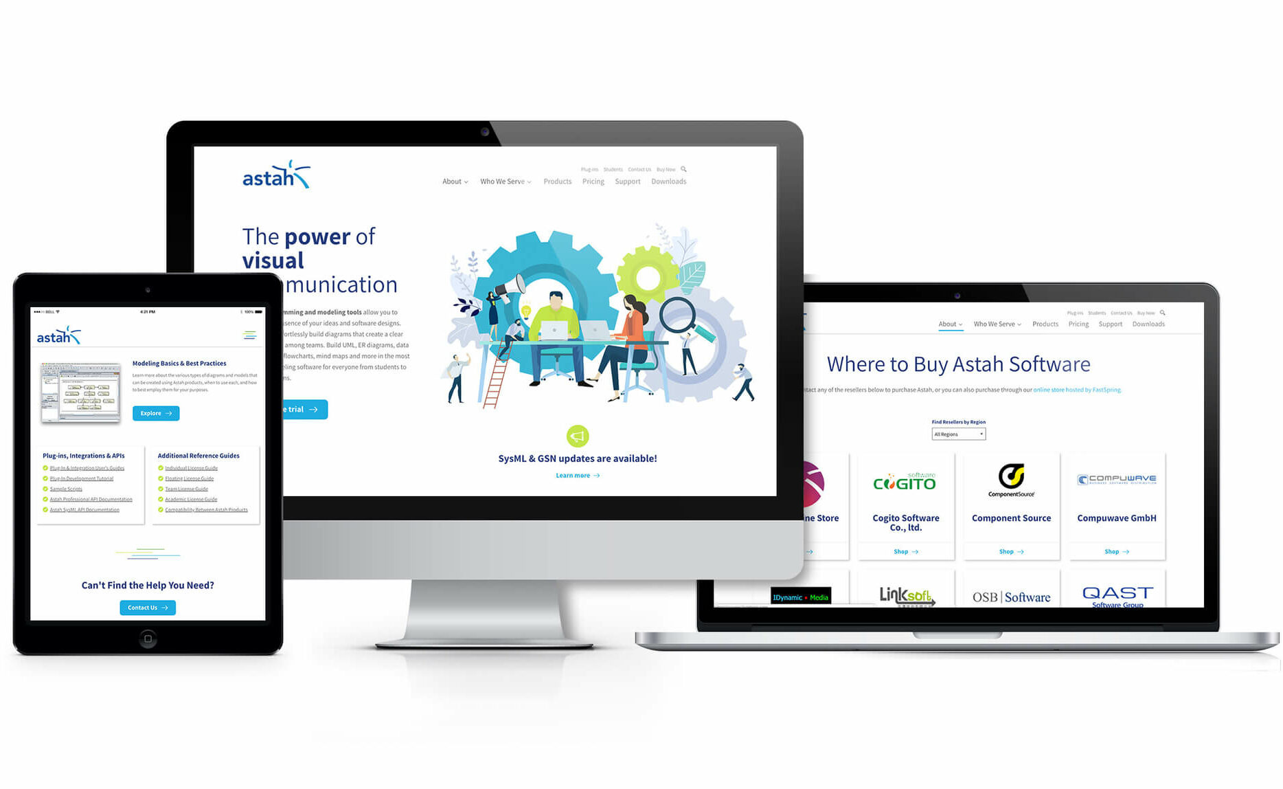
After reorganizing and rewriting content, we designed a sleek and fresh UI that married current design trends with Astah’s brand. Using bright illustrations on a white background with the vibrant blues and greens of Astah’s logo created a fun and approachable site.
On the back-end, we took advantage of the power and flexibility of WordPress’s Gutenberg blocks, creating a website that will grow with Astah without getting them into the organizational mess they were before!

The Outcome
Users love the new site and the Google Analytics stats prove it.
In just two weeks after launch, the number of total users increased by 198%, with new users increasing by 212%. Most of these increases were direct traffic, with a 592% increase, but organic traffic also saw a substantial 31% increase.
Page views increased by 70%, but, most importantly, the site saw large growth (215%!) in the number of views to their pricing page where the most important “buy now” actions are located.


